Onoma
A native iOS app helping couples find the perfect baby name through swipe-based matching and compatibility scoring
From initial idea to App Store: swipe-based interaction for quick decision-making, detailed name profiles surfacing pronunciation and etymology, and real-time collaborative matching between partners.
Key Metrics
Overview
Onoma is an iOS app that helps couples find baby names together. I designed and developed the entire product, from concept to App Store release, as a personal project.
The core design challenge: choosing a baby name is overwhelming. There are thousands of options, it's a deeply personal decision, and couples need to agree. How do you turn that into something that feels quick and fun instead of exhausting?
The Challenge
Baby name apps aren't new. Many already use swipe-based interfaces popularized by dating apps, and the basic idea of matching couples' preferences exists. But even the most popular apps share the same gaps:
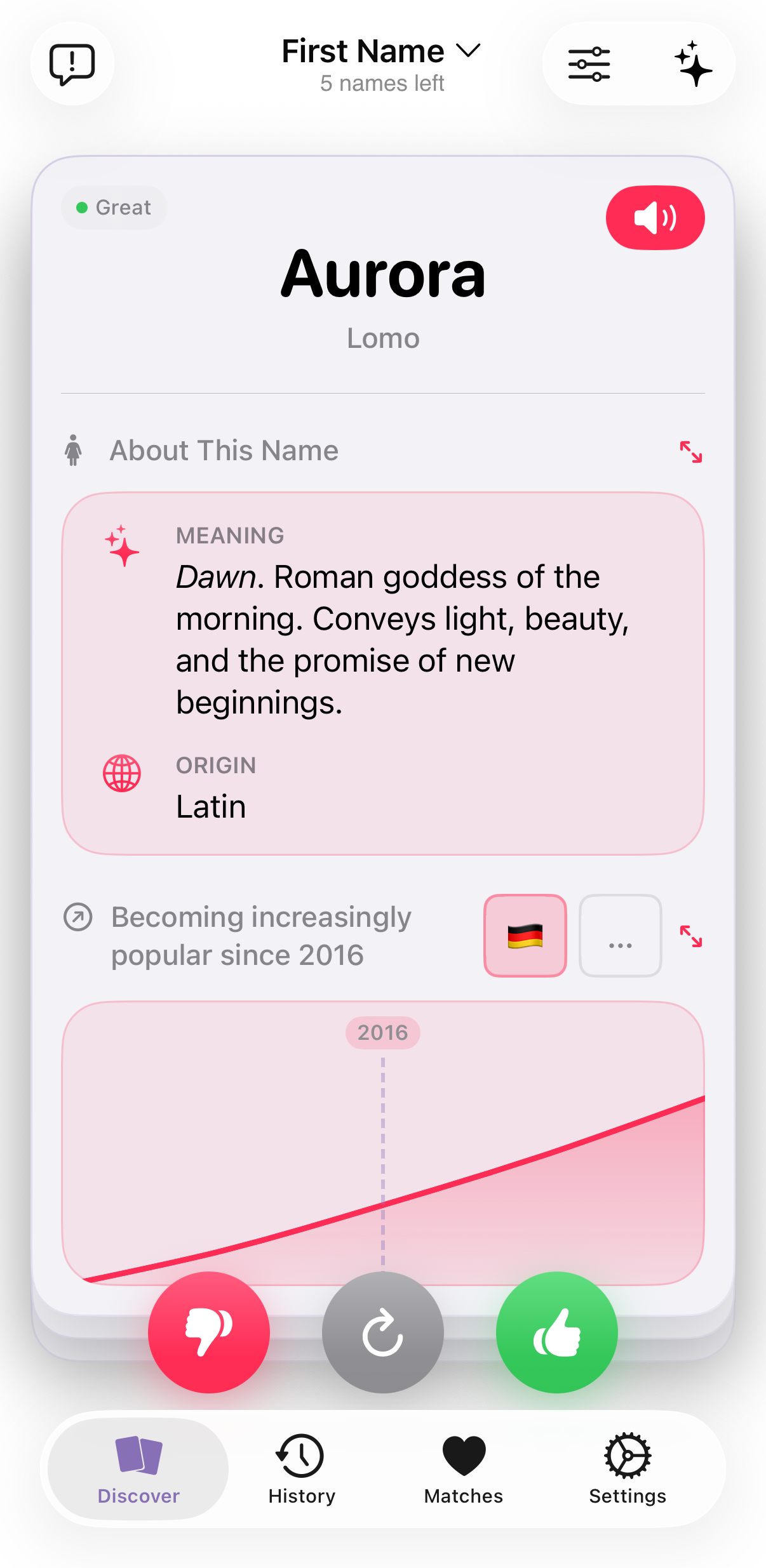
No context beyond the name itself. You see a name, you swipe. But how popular is it right now and how has its popularity developed in the past? How is it pronounced in your partner's native language? Does it sound good with your last name? Many apps treat every name as a blank card with no information to help you decide.
No help with name combinations. Choosing a first name is only half the decision. But what if the favorite name has been picked only to realize it doesn't work with the middle name the couple had in mind? And if the middle name is already set, finding a first name that fits is just as hard. Most existing apps don't support either direction.
Including others: all or nothing. Grandparents, friends, siblings: they all want a say. But most apps either exclude them completely or give them full swiping power. There's no way to let someone suggest a name without also giving them a vote in the final decision.
Decision fatigue despite swiping. Even the swipe mechanic gets tiring without structure. Thousands of names in a row, no filtering, no way to refine what you're looking for as you go.
Why the Swipe Pattern
The card-based swipe interaction, popularized by dating apps and already established in the baby name app category, was the right fit for several reasons:
- One decision at a time: Each card presents a single name, eliminating the paralysis of scanning a long list.
- Low-commitment gestures: Swiping left or right feels casual and fast, lowering the stakes of each individual decision.
- One-handed use: The swipe gesture works comfortably with one hand, whether on the couch or on the go.
- Built-in prioritization: Simply swiping yes or no naturally filters thousands of names down to a shortlist without requiring conscious ranking.
I validated the established pattern rather than reinventing it. Anyone who has used a baby name app already understands the interaction. This let me focus the design effort on what happens around the swipe: filtering, pairing, and the collaborative matching experience.
Key Design Decisions
Start swiping, refine later: Rather than asking users to set preferences before seeing any names, the app lets them start swiping immediately and refine filters as they develop a sense of what they like.
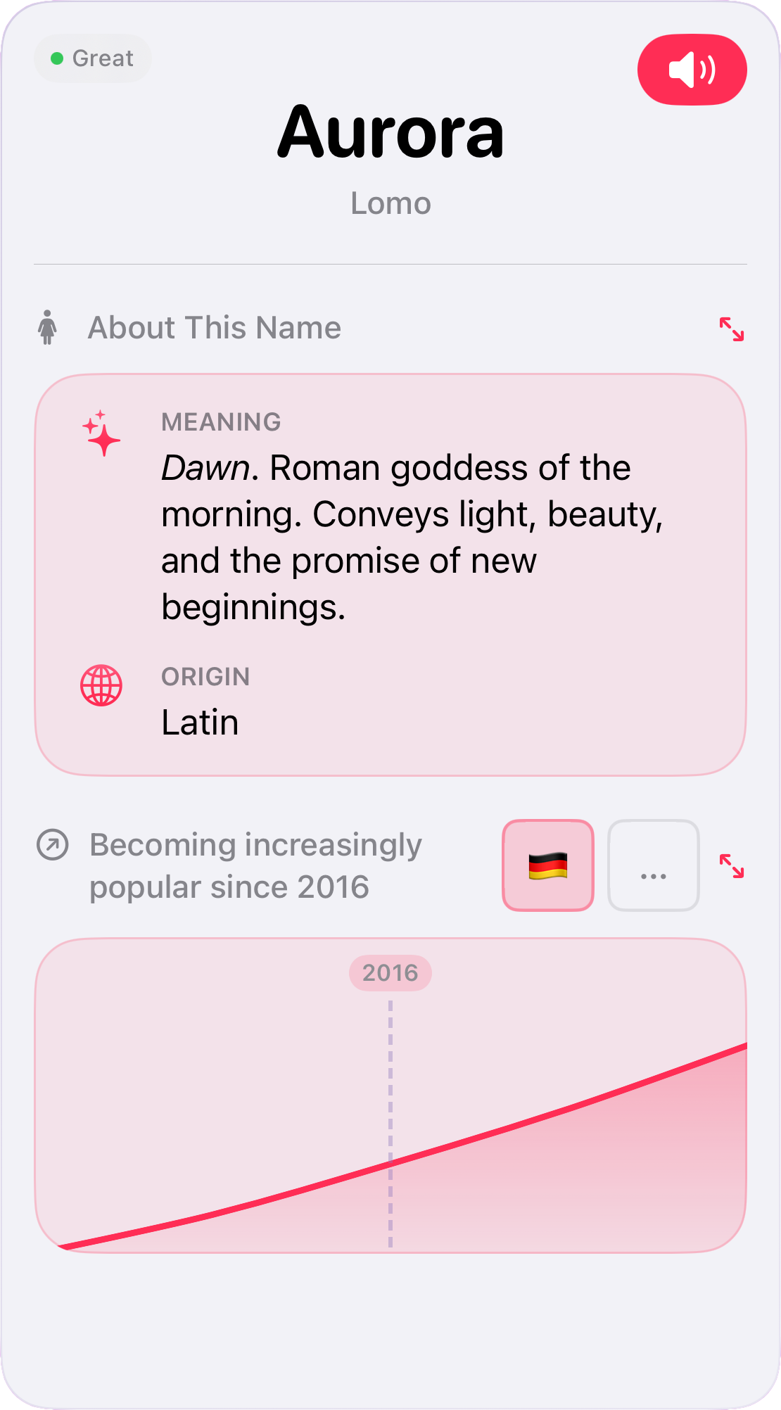
Rich name profiles: Each name comes with context to support the decision: current popularity statistics, audio pronunciation in multiple languages, and an analysis of how well it pairs with the family's last name. Instead of swiping blind, users can make informed choices.
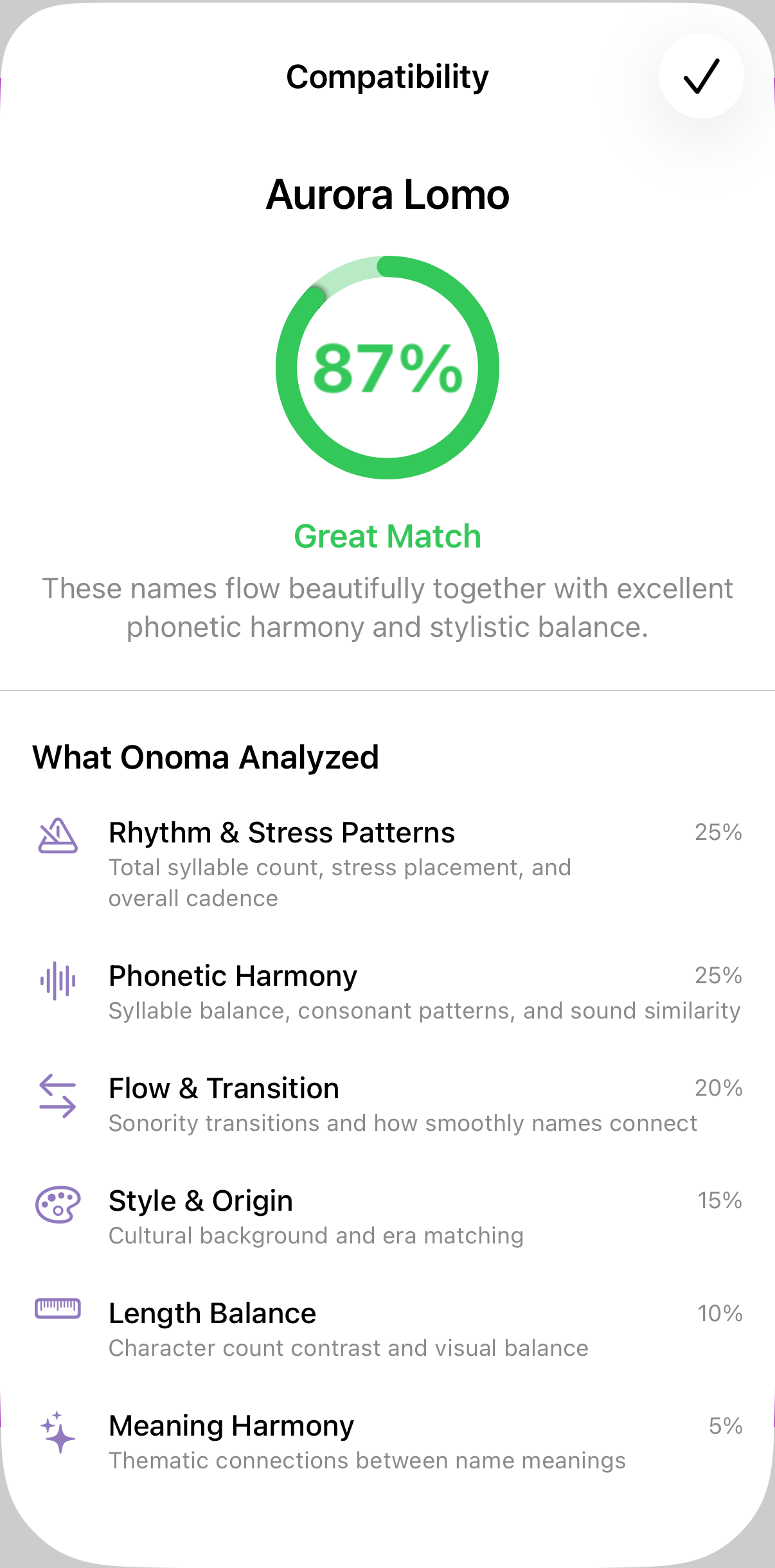
Smart name pairing: Once a first name is liked, the app suggests compatible middle names based on phonetic analysis, with a visual compatibility score. It works the other way too: if the middle name is already decided, the app helps find first names that sound good with it.
Offline-first by design: Baby name browsing happens in waiting rooms, on the couch, during commutes, often with unreliable connectivity. The app works fully offline, queuing decisions and syncing when a connection is available.
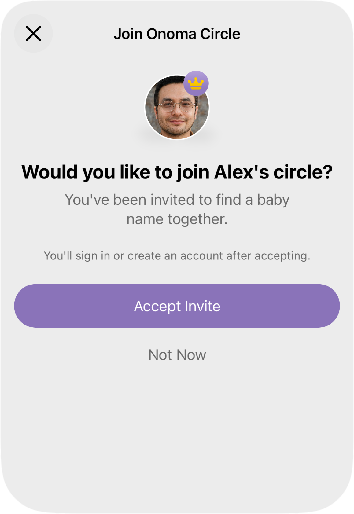
Friend and family input without chaos: A private web link lets loved ones suggest names without needing to install the app. They can contribute ideas, but only the couple can swipe and decide. The final say stays with the couple.
Business Model
The app is free to use, with a Premium upgrade available as either a one-off purchase or a monthly subscription. The subscription option reflects ongoing costs: server infrastructure and continuous maintenance of the name database. Premium unlocks all features (full name database, family sharing, and more). Importantly, only one person needs to be a Premium member: everyone swiping together gets full access automatically. Fairness as a design principle: if one person pays, everyone benefits equally.
Outcome
- Successfully launched on the App Store.
- A 63% download-to-signup rate suggests the onboarding communicates value quickly enough for users to commit.
- 12.2 sessions per active device points to sustained engagement. Users return well beyond initial curiosity.
- End-to-end product ownership: from identifying a user need through design decisions to a shipped, maintained product.
Interested in working together?
Get in touch