The Rise of Self-Service Kiosks
When I started my Masters degree back in September last year, this was my very first time in Scotland and the United Kingdom. On one of the first days, I strolled into a local Tesco supermarket store and was somewhat surprised to see self-service tills right next to a traditional one (which, by the way, was not staffed in that very moment). Being from Germany, I have heard of such systems but never encountered one anywhere in Germany — even though I was told that they were becoming more and more popular there too. As I love new technology, it was crystal-clear to give that self-service till a try. As to probably all people who use such a system for the first time, it was a quite exciting yet weird experience doing what used to be confined to a human cashier — and to use the infamous 'bagging area'.
Now, several months later, I have used the Tesco self-service kiosk dozens of times and learned to appreciate it. Probably the biggest issue with it is just that bagging area, where you need to place scanned items. This area is basically a massive scale and aims to make sure that the item you just scanned is also the item you then put in the bagging area. The way the system does this check is by measuring the weight of the items placed there and comparing it to the expected weight provided by the computer. When — and it is a question of when, not of if — this weight does not match, then the system assumes that the customer might try to trick it by scanning a cheap item and placing a more expensive one into the bagging area. When the system detects such a situation, a member of staff is alerted who essentially has to verify that the customer is not trying to fool the computer. In theory, this sounds like a good and reasonable way to prevent shopliftings. However, it turns out that there are false alarms fairly regularly. Be it, because someone placed an umbrella into the bagging area (it is rainy Scotland after all) or because of item-weight fluctuations. When visiting a store with let's say ten of these self-checkouts, then you could probably use all those 'please wait for assistance' messages to make the Jingle Bells melody.
Then there is this thing with the shopping bags. If you do not have one with you, then you need to pay for one. So how does this work with self-service checkouts? It turns out that you simply take one or more bags out of a box and 'tell' the system how many you took. Until recently, you would do this at the end of the checkout process by just keying in the number of bags. However, this led to an allegedly large number of customers steal bags — that is, taking them but keying in zero as the number of bags. Tesco has now changed their systems so that each bag has to be scanned just like any other item. This does not only allow you to put bought items into the bags while using the checkout system but apparently allows the member of staff who monitors the self-service checkout area to spy out bag thieves more easily. Did this change affect the user experience of that system? I do not have any data about that, but if I had to guess I would say it has not changed at all or improved slightly. Why? Scanning items is something people using these systems do all the time, it is the major part of the workflow. Scanning bags too integrates perfectly fine into that workflow.
Good and Bad Kiosk Designs
Speaking of user experience and Tesco self-service checkouts: I think, when looking at the bigger picture, it is remarkable what Tesco has achieved here — especially compared to the systems used at other supermarket chains. I used the one at Sainsbury's, Morrisons, Co-op, and even Lidl (yep, some UK branches do have them). Tesco's is the only one that is flexible enough to adjust itself to the user — and not the other way around. Let's look at some examples:
All systems display a launch screen with Start Scanning Items and Use My Own Bag buttons. The latter is used to calibrate the bagging-area scale. All systems, except the one at Tesco, require you to tap the according button and perform the corresponding action. At Tesco, you can simply start scanning, and the system automatically enters the scanning mode. Similarly, putting a bag on the scale calibrates it and then allows you to start scanning your items. That sounds like a small thing — and it really is — but it is that element of flexibility that can make the experience using these systems so much better and more efficient.
Here's another example: When you finished scanning all items, you enter the payment process where you can choose to pay by cash, card, coupon, or contactless. Also, this is where you can scan a loyalty card. Again, all systems except Tesco's require you first to tap the according button and then, for example, swipe your debit card. At Tesco, you simply swipe the card, put money into the cash drawer, et cetera. That is it. (Relating to the loyalty card, you can even scan it during the checkout just like any other item.) Again, this is a small thing — but the more of these little helpful features a system has, the better the overall experience for the user.
Check-In Kiosks at the Medical Practice
It turns out that Tesco is not the only store using self-service checkouts — other grocery stores like Lidl make use of them, too. In fact, they are not limited to grocery stores, but also found at Post Office branches and even in some medical practices (and at train stations, but that is not really surprising). Medical practices use them to allow patients to check in for appointments thus allowing the reception staff to concentrate on other tasks such as making appointments and answering calls. Pretty neat.
The self-service check-in system I used, convinced me with its design. Essentially, all it requires is to select your date of birth. What sounds easy to design is actually quite challenging, especially for kiosks: Using a free-text field is not really an option as it is too ineffective given that it would require validation and error-handling. A drop-down menu would be better, but also lacks that efficiency as you would have to scroll long lists for the day, month, and year. Option number three is a three-step process of entering the date of birth: Day, month, and year. Of course, the flipside of that approach is that you need to present a significant number of buttons and seeing thirty-one buttons at one time can be overwhelming and not very user-friendly. The designers of the system I used opted for that three-steps option — and they did a good job on eliminating its flipside.
So, what did they do?
They made use of the fact that the computer, of course, knows who has an appointment today. So, instead of displaying, for example, a button to select ten as the day of birth even though there is no patient with such a birth date on the given day, they simply removed that button from the interface. Again, this is a simple but clever and very efficient solution. Also, by the time you have selected the day and month of your date of birth, the number of options for the year selection is typically rather small. It gets even better: Let us assume that there is only one patient born on 11th April who has an appointment today. Instead of asking the patient to pick the (only) option on the year-selection page, it simply skips that step. Again, well designed.
After selecting your date of birth, the system displays your name, the time of your appointment, and the doctor you are going to see. If you are on time (in this case, that means you arrived at the practice not more than twenty minutes early and not more than five minutes late), then tap Check-in, and off you go. Alternatively, you can cancel the check-in process and start over again — or leave the practice because the computer tells you that you are way too early (I speak from experience…).
With all that praise, let us face that filtering technique has one flaw: Some people might not understand that if the computer does not provide an option to select their day/month/year of birth, they do not have an appointment today. You could argue that this does not happen as people do not try to check-in without an appointment — but imagine you are mistaken about the day and get there one day early. That indeed happens, as I was told by the friend of a friend's friend…
Semi-Automated Systems
Finally, an example of bad self-service kiosk design.
An increasing number of UK Post Office branches is now equipped with self-service kiosks that allow you to post pre-paid parcels (think of Amazon returns), to buy stamps and packaging materials, and more. This sounds very handy, especially since some Post Office branches tend to be really busy at certain times, and I do like the idea behind this kiosks.
But!
Unfortunately, especially this process of posting pre-paid parcels is really inefficient and was definitely not designed with the user in mind.
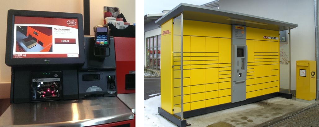
To better understand what I mean, let us first have a look at DHL Germany's Packstation. That is essentially a series of connected and electronically controlled lockers that can be used to send (and receive) parcels. These self-service systems are now very popular in Germany and can be found in virtually every small and big city. Before using it for the first time, you have to register for free to get a membership card. After doing so here is how to use a Packstation: Insert your membership card, scan the barcode of your pre-paid parcel, and put it into the locker that opens automatically. Done.
So, how does this compare to Post Office's solution? Well, you first tap Send Pre-Paid Parcel. Fair enough. Then you have to scan the barcode of the pre-paid parcel. That is where it could already become complicated as the scanner is mounted very close to the 'tray' of the kiosk. See how this compares to a Packstation:
-
 12
12
So this means that you somehow have to position your parcel in a way that the system can scan the barcode. Alternatively, you give up and enter the barcode by hand instead. It is certainly good to have this option (remember Tesco's flexible self-service checkouts) — but keying in a long combination of characters is very error-prone and everything but user-friendly.
If you succeeded at that step, you are prompted to pop your parcel on a scale. Then, after the computer has taken the weight of the parcel, remove it from the scale. Next, key in the postcode of the recipient. After that, key in the name of the recipient. That are two more chances to make input errors — and it does not seem that the system even validates the data. You now automatically return to the main menu where you see the content of your basket. A basket is something most people can relate to as they know it from shopping online and, of course, from the origin of that metaphor, the physical shopping basket. So it is a good thing.
Wait, how do you remove specific items from it?
On the screen, you see a bunch of buttons on the right. One of them is the Send Pre-Paid Parcel button used to add that parcel to the item in the first place. Then, there's a Checkout button which is pretty self-explanatory — even though it comes with a surprise, but more about that later. Of interest right now is the Cancel button which is located right next to the Check-out one. Check-out means that you finish off the entire 'purchase' so, one could assume, Cancel cancels the entire purchase. What really happens is this: By tapping Cancel you go to another screen which lists all items in your basket again, but this time also offers one Cancel button for each of them. Did you expect this behaviour? I certainly didn't. You could risk tapping Cancel and see what happens — but imagine this would have really emptied your whole basket… a real nightmare!
Now, let's get to the Checkout button. This is where the biggest of all surprises come into play, especially if you know the Packstation system or the similar Amazon Locker system.
The system prompts you to wait for a member of staff to reach out to you, pick up the parcels, print out your receipt and finally let you go. Again: You have to wait for assistance. Why's that a problem? Well, imagine it is peak time, and all members of staff are busy. You use the self-service kiosk to save time but instead, you might even waste more time than you would when having used those good old staffed counter desks. Also, why do you have to provide information that the system is already aware of? Postcode and name of the recipient are already encoded in the barcode, and the fact that they are not error-checked suggests that they are not even used for anything than being printed on the receipt. Or is that the whole point? But then, why are these steps not optional?
No, that is certainly not what you would call a well-designed self-service kiosk. It is almost the opposite of it.
It is Here to Stay
So, even though the Post Office self-service kiosks definitely have some room for improvement, they and the rise of self-service systems found at supermarkets, train stations, banks, medical practices and so much more clearly show where we are heading.
In the United Kingdom and, of course, many other parts of the world, where there are much more self-service kiosks than, for example, in Germany, it seems that many people have not only accepted the rise of this technology but also appreciate it. However, and this is a cliché becoming true, they seem to be widely performed by rather young folks. This shows one of the challenges self-service kiosk designers face: How to make this technology more accessible to 'older' people?